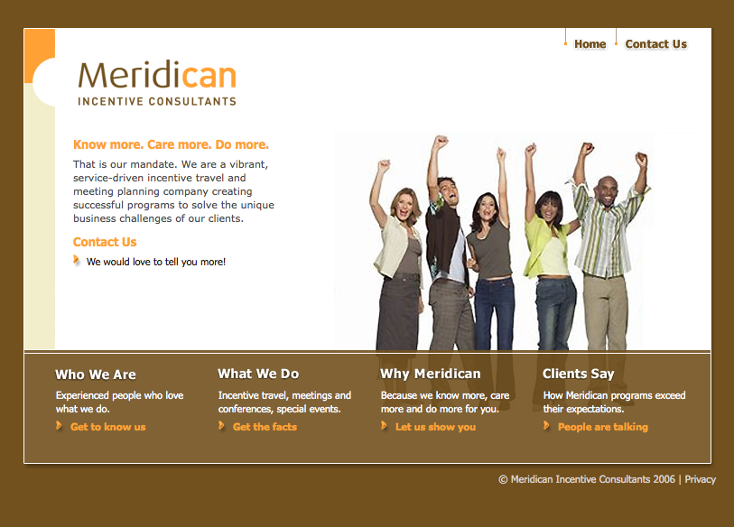
Case Study: Meridican Website Refresh & Image Overhaul

Meridican creates spectacular incentive travel and CSR programs, and plans meetings, special events and corporate branding initiatives for clients like RBC, Home Hardware, U.S. Foods and more. With a staff of 28, and over 30 years in business, Meridican was in dire need of a website that better reflected their range of services, vast experience and fun-loving personality.

Meridican-site-BEFORE

BEFORE:

  • Photos. Stock images sometimes had a whiff of fakery.
  • Design. Box-inside-a-box design was dated, and its restrained size lacked visual impact. Heavy amount of brown was weighing it all down.
  • Copy. Vague and failed to engage. The HOW (how do they do it?) was conspicuously absent.
  • Navigation. A maze of submenus produced an unfriendly and at times frustrating experience.
  • Functionality. The website was only built for desktop computers; it could not be viewed efficiently on mobile devices.

AFTER:

  • Photos. We populated the site with photos of real people doing real things. The two women pictured at right are actual participants enjoying a real incentive travel/CSR program organized by Meridican.
  • Design. Taking advantage of available real estate, we placed a large rotating slider above the fold, filled it with big, bold images that conveyed the company’s services and personality. We punched up the heavy brown with orange and a breath of fresh white.
  • Copy. To reinforce visual storytelling we appointed three carefully chosen words for each slider. Immediately below: “Teams work better when they play together.” The copy is authentic; for anyone who knows the playful team at Meridican, it sounds just like them. But don’t just take our word for it:

Veteran editor Julie Charles, who knows the company, had this to say:

“I was immediately impressed by how friendly and conversational the language is–definitely not your standard-fare, corporate-speak kind of website. Love both the words and the visual approach. Reflects the brand so well.”

  • Navigation. Six tabs in the main nav bar, each labelled with a single word makes the experience easy and fast. Why? Because we respect your time (and know you don’t have a lot of it).
  • Functionality. We produced a completely mobile-friendly site that can be viewed on any type of device, big or small.

SHOW ME THE GOODS

“From Day One I was extremely confident in Pixels & Prose and knew that a partnership had truly been created. Sherryll and Maureen never let us down, the timelines were always met, challenges (if any) were discussed immediately, and necessary adjustments were made seamlessly. I could never have imagined that the process of a total redevelopment of our website could be so easy! We are so pleased with Pixels & Prose that we’ve retained them to design and write our quarterly newsletters and blogs.”

Terry Manion, Executive Vice President, Meridican

Ready To Stand Out?


Reach Out To Us

Leave a Reply